How great would it be to see your product portfolio in terms of volume, variability, and velocity at a glance on one chart?
Remember the last blog on descriptive statistics describing the Volume/Variability Matrix?
- For views of inventory, the data element Item-Location (SKU) becomes your meaningful element. Take a 12-month data stream and measure standard deviation and mean. Divide the standard deviation by the mean and call it COV (coefficient of variation). Segregate your SKUs by a hurdle rate for your business, say 0.50. If the variability of the SKU is greater than 50% of the mean, call it HIGH VARIABILITY. Now you have a descriptive statistic for that SKU. Get fancy and call those SKUs below a COV of 0.50 LOW VARIABILITY. Create a hurdle rate for volume and you’ll soon have a four-quadrant system showing: High Variability/High Volume; High Variability/Low Volume; Low Variability/ Low Volume; and Low Variability/High Volume.
- Now add the Average Demand Interval to estimate velocity. Count the number of months out of 12 the product ships for each SKU. Then divide this number into 12 to create the Average Demand Interval. 12/12 =1, so these SKUs show the highest velocity. 12/4 = 3, so this SKU moves every 3 months. Good to know which products move quickest with the most volume and the least variability, or which slow down the revenue stream with low velocity, low volume, and high variability.
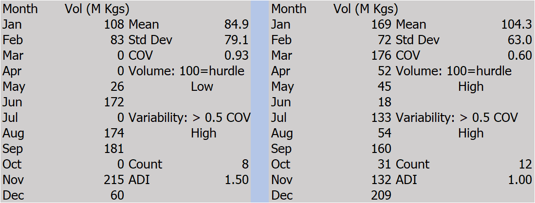
To illustrate the detail, you can picture a sampling of how to calculate these descriptive statistics:
Table I. Sample Calculations of Descriptive Statistics for Volume, Variability, and Velocity (=ADI)
Add the miracle of computing with Excel, SQL, and a talented Developer, or software provider, and you’ll create a matrix chart giving visibility to Volume, Variability, and Velocity of your chosen set of SKUs. (More on the chosen set later.)
Fig 1. Three “V” Portfolio Chart by SKU for 12-Month Sales/Shipments
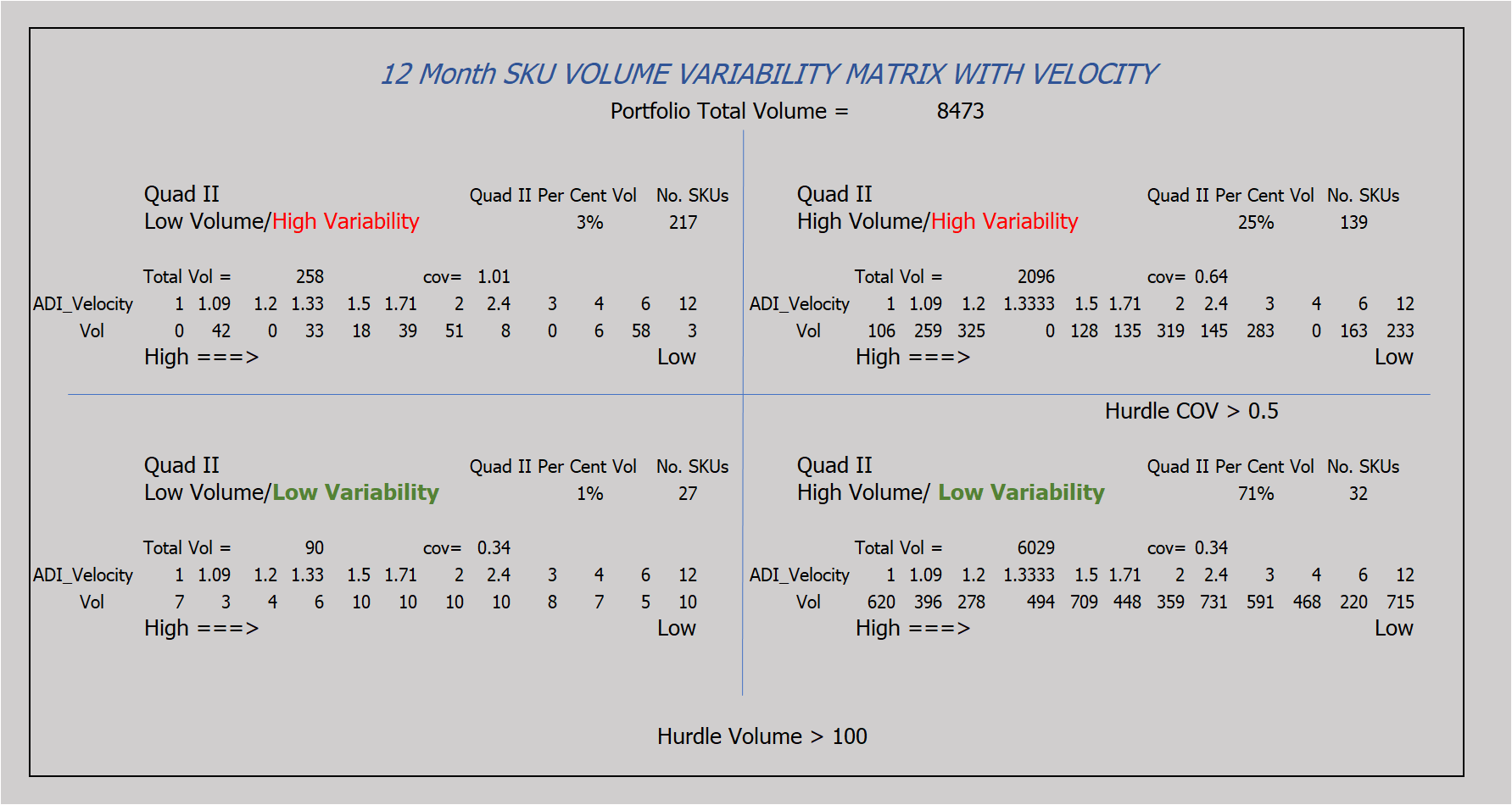
In this example:
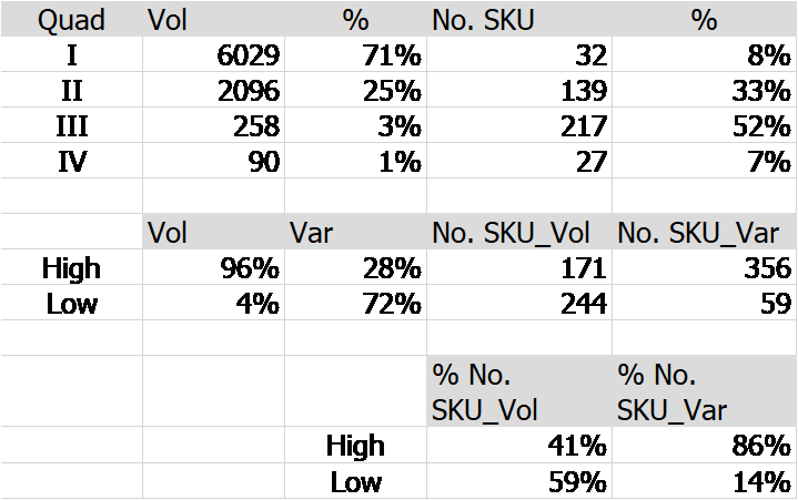
- 96% of SKU volume = High Volume & 28% of SKU Volume = High Variability, and
- 4% of SKU volume = Low Volume & 72% of SKU Volume = Low Variability, and
- 86% of SKUs = High Variability & 14% of SKUs = Low Variability, and
- 41% of SKUs = High Volume & 59% of SKUs = Low Volume
Remember, Quad I & II represent High Volume and Quad III & IV represent Low Volume, likewise, Quad I & IV represent Low Variability and Quads II & III represent High Variability.
[Read More: Who Should Take Ownership of Finished Product Inventory Management?]This may be easier to visualize in a dashboard:
Now, what do you do with this?
- Assuming your supply chain runs better internally and delivers better customer satisfaction externally with lower variability, one would attempt to MANAGE the variability of the high variability SKUs. Could this mean adaptable and flexible manufacturing? Could this mean collaboration with the customer to understand demand patterns? Notice how zero demand months cause issues with COV.
- For high volume low variability SKUs, could we use dedicated manufacturing facilities with forecasting and safety stock, pull-replace with buffer monitoring, or combinations with sales policies?
- Do we review low-velocity products for pruning? Do we reward High Volume, Low Variability, and High-Velocity SKUs? How do we treat Low Volume, High Variability, and Low-Velocity SKUs?
The Chosen Set of Data
So far, we’ve discussed SKU data. What if:
- As a Black Belt Consultant, you might want to review the entire portfolio by SKU, then segment by Product Family, or by manufacturing location, or by Sales Region, or by Top/Bottom customers, or by Sales Rep, or by the manufacturing process, or by replenishment type, or by stock-outs. Can you think of more to peel the onion?
- As a Product Manager, you might want to review the portfolio by SKU, for pruning purposes using the above segments. Do you prune a Low Volume, Low Velocity, & High Variability SKU? What are your criteria for pruning when you attach revenue?
- As a Demand Planner, you might want to review the matrix each week for Stock Outs as feedback to Customer Service Reps and/or to review planning parameters to prevent this defect from occurring. The matrix chart suggests which ones to attack first with the most impact.
Last thoughts:
Remember, the data shown here uses demand history by SKU, therefore, it represents a snapshot. Since we all know nothing stays the same, a good planning system shows historical snapshots of charts and graphs to show trends over time. These charts and graphs may then be used for alerts to better manage daily issues with the portfolio as well as predictive analytics depending on your business and the creativity of your resources.
Enjoyed this post? Subscribe or follow Arkieva on Linkedin, Twitter, and Facebook for blog updates.