
Here’s how you can use different types of maps to enhance your supply chain visibility.
When working with a new dataset, it isn’t uncommon to want to add mapping to your arsenal of analytical tools. Tying your data to maps can be a powerful way to look at your data – our brains are naturally wired to find patterns and arranging data spatially can facilitate connections that a graph or a table just can’t replicate. Data is beautiful because a picture is worth a thousand words, but what kind of map is ideal for bringing your data to life?
Choosing Maps for Your Supply Chain Dashboard
There are several types of maps to consider when designing a dashboard as well as data transformation choices to make before you are ready to best display your creation.
Choropleth or Proportional Symbol
The first decision is often the choice of whether to use a choropleth map or a proportional symbol map (sometimes called a bubble map). There are advantages to either one, so a basic understanding of their strengths and weaknesses can help you make the right choice.
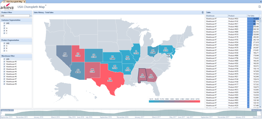
One thing to be aware of when picking a choropleth map is that not all polygons are created equally. Macedonia is 1/16th the size of Germany, but if your profit is the same from each country, the smallness of Macedonia may cause that information to get lost by the end user.
More than any other map, the visuals of a choropleth map will have a strong correlation to the physical borders of the entities. For that reason, it is important that the data you want to map have a strong correlation to those entities. For example, financial data has an intrinsic currency underpinning it. Since currencies have a very high correlation to political boundaries, a choropleth map of political boundaries tied to financial data makes sense. On the other hand, your customers are more likely to be mobile and can easily relocate, shift their ship-to destination, or are otherwise not naturally tethered to a zip code, a county line, or an area code boundary. Customer data may not be best represented by a choropleth map and you may benefit from a proportional symbol map.
In addition to the correlation of the data to physical boundaries and the size of the polygons, there is also the issue of standardization. Even though Germany is roughly 16x the size of Macedonia, it has about 40x the population. Coloring a map purely on a total count such as population disconnects the data (people) from the geospatial element (boundary within the map). Converting your population data from a raw count to a standardized unit such as population per square kilometer will make the map more meaningful.
Thinking about your own data, how can you standardize it so that a choropleth map becomes more useful as a tool for analysis? If dividing your quantity by the area of a polygon doesn’t make sense, you may have other tools already at your disposal that help bridge that gap. Perhaps you have a target for a region. That target was probably intelligently chosen with consideration given to the properties that make that polygon unique. In that case, standardizing by converting your raw count to a proportion of your target could improve your map to give you something closer to an apples-to-apples comparison when looking at Germany’s data next to Macedonia’s.
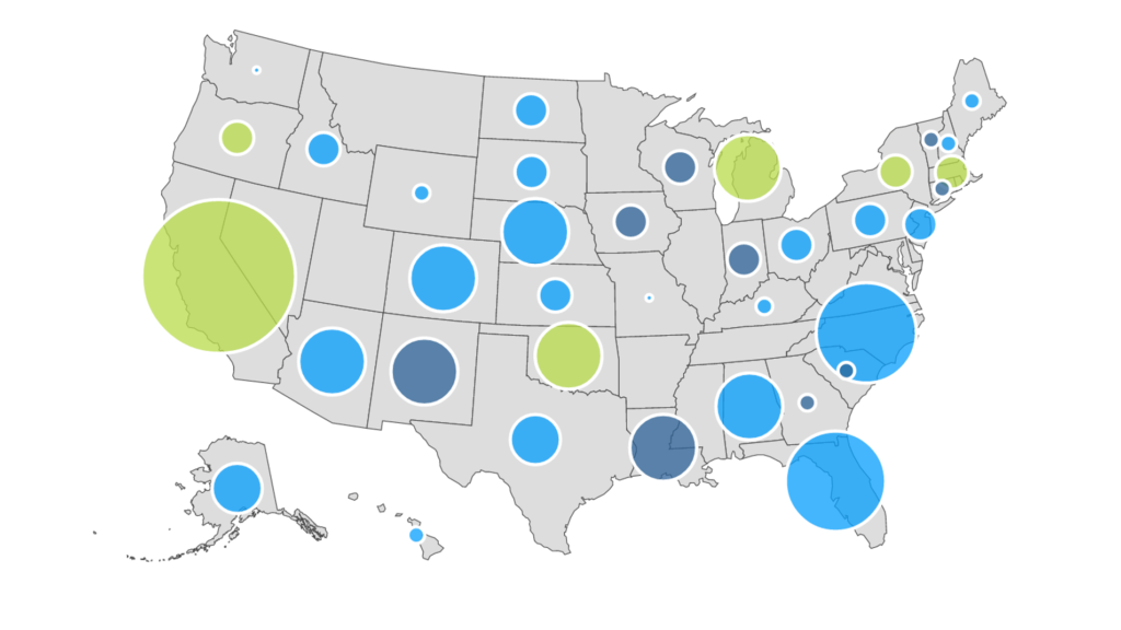
If a choropleth map isn’t the right tool, consider a proportional symbol map. Joining latitude and longitude to a qualitative attribute from your data, you can spatially place your data on a map. The quantity can drive the diameter (or color, if the situation calls for it) of each symbol, providing the user with the ability to compare quantities at different locations without regard for geographical boundaries. Given that strength, it makes sense then that this type of map is best suited for data that has little or no correlation to the boundaries of your map.
Be forewarned, however, because the proportional symbol map suffers from the same drawback that pie charts suffer from – difficulty for the user to compare different data with precision. When you see a smaller circle next to a larger one, are you able to give a good estimate of the numerical difference between the two data points?
While a legend or, when working with a digital map, a tooltip can help alleviate this weakness, another way of overcoming this shortcoming is to introduce classifications into your map.
How and When to Classify the Data
Imagine a map of Europe with your top 100 customer ship-to data on it. Do you have 100 different sized symbols on the map? Could you quickly identify those that would be considered the middle quintile? It would be difficult. If you add a window to your data query and transform the raw counts into quintiles, you can limit the nuance and guide your end user to the type of analysis she needs to perform her job.
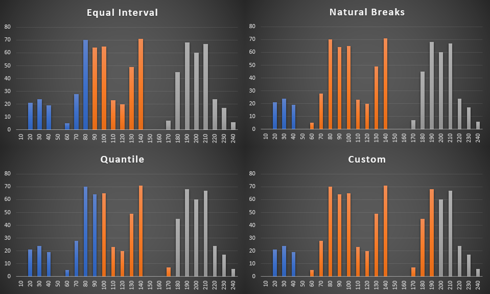
There are several ways that you can introduce classifications. You could break your data into equal intervals so that for every data of x size, there is one of y and one of z sizes as well. Alternatively, the minimum and maximum values could be determined so that the classification breaks fall evenly with regard to the range of possible values. Perhaps your data has natural breaks that can be programmatically implemented. Lastly, you could manually set your classifications – perhaps to isolate outliers for action, or maybe to be ignored.
Classification can be done for both choropleth maps and proportional symbol maps.
You can also adjust how color is used for each of these maps. For bubble maps, color can be used as a subgrouping feature, or as bivariate analysis. Is a metric in the top tier? Make its size large. Is that metric exceeding, within an acceptable tolerance, or falling short of its target? Color it green/yellow/red. Now you have more ways to slice your data to tell the story. Is profit margin data marred by the exchange rate, or newly introduced tariffs? Bake that comparison into your color scheme to help explain why the main quantity is showing what it is.
Other types of Maps for Dashboards
There are numerous other types of maps available – dot density maps, proportional area maps, and others each have specific purposes where they excel. Sometimes you’ll need to transform your numbers through standardization or classification and other times your data might be ready to go. Hopefully, this post has given you a few key takeaways to consider when deciding to add maps to your data.
Enjoyed this post? Subscribe or follow Arkieva on Linkedin, Twitter, and Facebook for blog updates.