
If you’ve every looked into the Demand Driven model, you’ve probably seen charts with red, yellow, and green. Maybe also some dark red and blue, which is not so good.
In a Demand Driven model, we monitor the health of flows and inventories using these color codes. So the goal is going to be, over time, to have more green, and certainly less blue and dark red.
Is the goal here to get more green?
Yes… and no.
Your teams need to understand what these color codes mean, what conclusions to draw, and what actions to take.
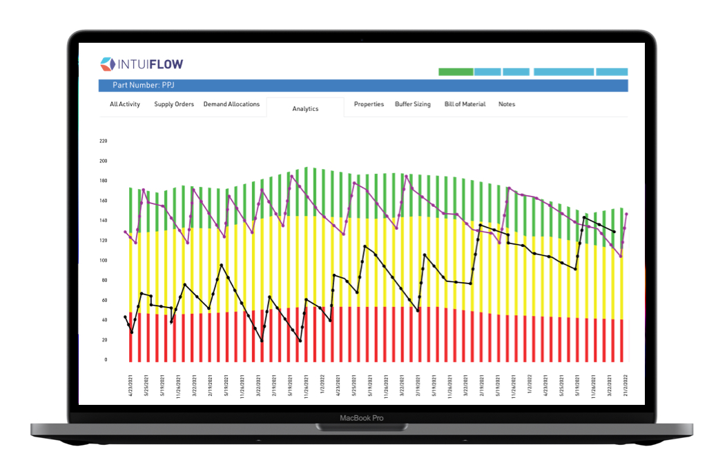
There are two main measures for a DDMRP inventory model: the net flow equation (used to generate orders), and the inventory itself.
The Planning View
When we analyze the net flow equation over time, if we have more and more items in green status, it means that we are following the replenishment discipline. When the flow equation goes below the top of yellow, we go back up to the top of green, so at the end of each day we have a maximum of green items, if we have placed the recommended orders.
So, when we have more green, it means we are following the recommendations.
Is this a guarantee of results? Will stock-outs decrease and stock turns increase?
Not necessarily — it just reflects our operating discipline. If the buffers are well sized and adapted over time, yes, the performance should improve. And, if the performance is not there but we followed the recommendations, it means that the model is not well sized.
Following the discipline is a prerequisite. It is necessary, but it is not sufficient.
Let’s look at an example. You don’t have enough capacity, so you can’t replenish all your items at the top of the nominal buffers. If you keep your buffers unchanged and run according to the recommendations, you will generate many orders beyond capacity, you will clog up the shop, and drown in priorities. You will still be green.
In this case, you have missed an essential element: Matching your buffers to capacity. Just like a good old MPS, buffers must be realistic and aligned with your demonstrated capacity.
Let’s look at another example. You always generate orders to top of green, and yet you have many shortages, maybe because your lead times are longer than the ones used to size the buffers.
More green in planning? Yes, but keeping buffers properly set via DDS&OP.
The Execution View
Ah, now you’re going to tell me, in the execution view, if we have more green it’s because we’re getting better — since we are focusing on inventory, our inventories are healthy!
Yes… and no.
On the one hand, the green status of an item can be assessed in different ways. You can consider it green only when the stock is in its ideal target zone, from top red to top red plus green. This is usually too narrow. Or that you’re green when the stock is in the yellow planning zone, or it doesn’t exceed the top of the green planning zone… which is a bit lax. You need to agree what is green for you.
On the other hand, the more green and yellow areas you have, the greener you are going to be, mechanically. Therefore to get greener, all you have to do is increase your batch sizes and lead times…which is not where you want to be.
Combine Discipline with Model Improvement
Visibility into the health of inventory and flows is an essential contribution of Demand Driven approaches, but like any KPI it must be accompanied by the right understanding, management, and adaptation rituals. This is essential to involve teams in continuous improvement.
At the end of the day, your real KPIs remain the service rate / out-of-stock, stock turns, and operating costs!