Remove data-visuals
article thumbnail

Jump Technologies Introduces New Data Visualization Capabilities for Hospitals

Supply Chain Brain

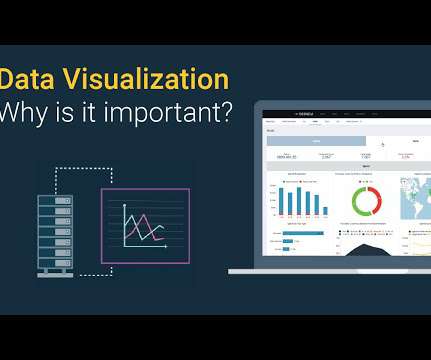
Jump Technologies, a hospital supply chain solutions provider, announced today the expansion of its JumpStock capabilities to include data analytics and supply chain visualizations.

article thumbnail

Your Data is Only as Good as How You Visualize It

Arkieva

Are you avoiding these common data visualization pitfalls during your S&OP meetings? Your Data is Only as Good as How You Visualize It was first posted on February 27, 2019 at 1:34 pm. ©2017 " Supply Chain Link Blog - Arkieva " Use of this feed is for personal non-commercial use only.

S&OP 81
Insiders

Sign Up for our Newsletter

This site is protected by reCAPTCHA and the Google Privacy Policy and Terms of Service apply.

article thumbnail

Do You Need a Graph?

Supply Chain Shaman

In these conventional IT approaches, data is written and coded with fixed semantics into rows and columns. I term this our data jail. Still, they are ineffective in analyzing flow, understanding relationship patterns, using disparate data, or driving multi-tier insights. As a result, data query is fast.

article thumbnail

Infor Nexus is Taking an Interesting Approach to Generative AI

Logistics Viewpoints

This check involves connecting carrier contract data and shipment dwell times. They look at the data and ask themselves, “is this a problem?” Mr. Sorgie calls this “rich visual controls.” These visual controls present the information in an intuitive and verifiable way and enable the users to dive right into the data.”

article thumbnail

Monetizing Analytics Features: Why Data Visualizations Will Never Be Enough

Think your customers will pay more for data visualizations in your application? But today, dashboards and visualizations have become table stakes. Five years ago they may have. Discover which features will differentiate your application and maximize the ROI of your embedded analytics. Brought to you by Logi Analytics.

article thumbnail

The Importance of Data Visualization

Enterra Insights

But as an information designer, Lupi also saw opportunities to make the charts even better — more data-rich, allowing for uncertainty, and adding more context, nuance, and humanity. Amidst all the talk about the value of big data in business, there isn’t enough discussion about how analyzed data is visualized.

Data 173
article thumbnail

Accelerate Model Building with SC Navigator’s New Whiteboard Functionality

AIMMS

SC Navigator's new Whiteboard functionality visually maps supply chains, simplifying data input for efficient modeling.

Modeling 156
article thumbnail

Monetizing Analytics Features: Why Data Visualization Will Never Be Enough

Think your customers will pay more for data visualizations in your application? But today, dashboards and visualizations have become commonplace. Which analytics features are replacing visualizations as “the next big thing”. Five years ago they may have. You’ll learn: The 3 benefits of deeply embedding BI.

article thumbnail

Drive Better Decision-Making with Data Storytelling

Storytelling is more than just data visualization. Storytelling provides an organized approach for conveying data insights through visuals and narrative. Data-driven storytelling could be used to influence user actions, and ensure they understand what data matters the most.

article thumbnail

Monetizing Analytics Features

Think your customers will pay more for data visualizations in your application? But today, dashboards and visualizations have become table stakes. Five years ago, they may have. Turning analytics into a source of revenue means integrating advanced features in unique, hard-to-steal ways.

article thumbnail

How to Build Data Experiences for End Users

Organizational data literacy is regularly addressed, but it’s uncommon for product managers to consider users’ data literacy levels when building products. Product managers need to research and recognize their end users' data literacy when building an application with analytic features.

article thumbnail

The Definitive Guide to Dashboard Design

That’s one of the many reasons we wrote The Definitive Guide to Dashboard Design—to help you avoid common pitfalls, including… Cramming too much onto one screen and expecting the user to figure out what’s interesting and relevant on their own Getting carried away with fonts and colors so the user is distracted by formatting instead of focusing on the (..)

article thumbnail

New Study: 2018 State of Embedded Analytics Report

Why do some embedded analytics projects succeed while others fail? We surveyed 500+ application teams embedding analytics to find out which analytics features actually move the needle. Read the 6th annual State of Embedded Analytics Report to discover new best practices. Brought to you by Logi Analytics.

article thumbnail

5 Early Indicators Your Embedded Analytics Will Fail

Many application teams leave embedded analytics to languish until something—an unhappy customer, plummeting revenue, a spike in customer churn—demands change. But by then, it may be too late. In this White Paper, Logi Analytics has identified 5 tell-tale signs your project is moving from “nice to have” to “needed yesterday.".